EquaCommandCenter
Last Verified: 2026-05-20 | Storybook source: equa-patternlib-nextjs/stories/EquaCommandCenter.stories.tsx, Line: 27
Purpose
Full command-center shell reference for gateway-aligned operations UI.Storybook
| Story | Reference |
|---|---|
| Full Screen Default | Storybook |
| Left Sidebar Expanded | Storybook |
| Left Sidebar Collapsed | Storybook |
| Priority Stack Expanded | Storybook |
| Priority Stack Collapsed | Storybook |
| Task Thread Granular Components | Storybook |
| Priority Granular Components | Storybook |
| Status Update Popup | Storybook |
| Status Update Workflow | Storybook |
| Loading State | Storybook |
| Empty State | Storybook |
| Blocked State | Storybook |
API And Props
| Prop or Control | Source | Notes |
|---|---|---|
| UNVERIFIED | Not exposed in Storybook argTypes | Review component TypeScript interface |
equa-patternlib-nextjs/src/components/commandcenter/commandcenter.tsx, Line: 33equa-patternlib-nextjs/src/components/commandcenter/index.tsequa-patternlib-nextjs/stories/EquaCommandCenter.stories.tsx, Line: 27
Figma
Open Figma referenceScreenshots
| State | Asset |
|---|---|
| Equa dark theme | 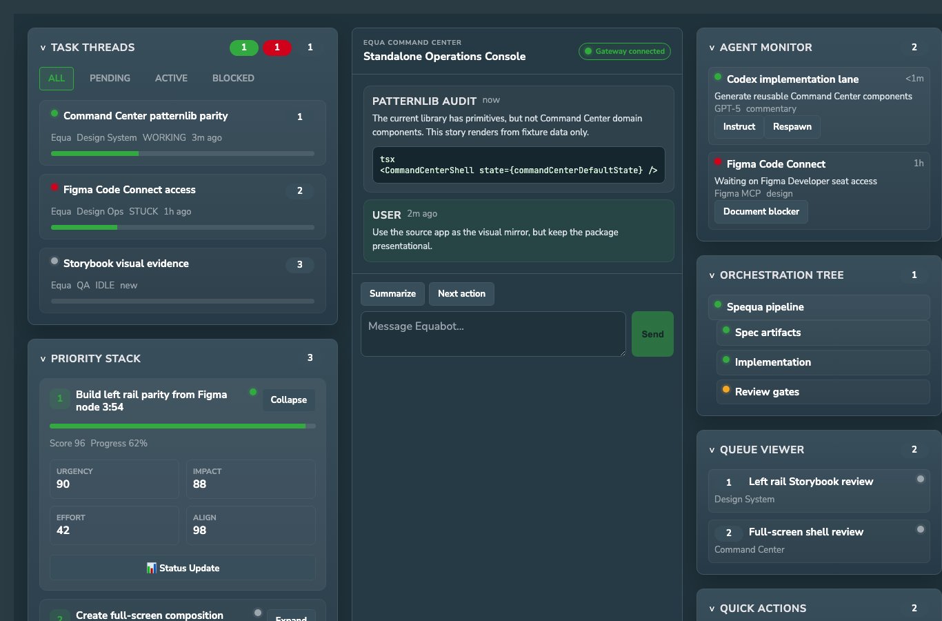 |
| Light theme |  |
Usage Notes
- Prefer this component over local one-off UI for matching product states.
- Keep new variants represented in Storybook before adding docs references here.
- Use token-backed colors, spacing, radius, and shadows from Foundations.
Accessibility Notes
- Preserve keyboard and focus behavior from the source component.
- Any icon-only controls must provide an accessible label in consuming product code.
- Validate color contrast in both Equa dark and light theme screenshots before release.