EquaPluginsDashboard
Last Verified: 2026-05-20 | Storybook source: equa-patternlib-nextjs/stories/EquaPluginsDashboard.stories.tsx, Line: 17
Purpose
Figma-mirrored plugin dashboard surface and subcomponents.Storybook
| Story | Reference |
|---|---|
| Final design — full dashboard | Storybook |
| Top Bar | Storybook |
| Runtime Providers | Storybook |
| Install From Git | Storybook |
| Installed Plugins | Storybook |
| Plugin card — bundled, inactive | Storybook |
| Plugin card — long description | Storybook |
| Plugin card — auth required + command | Storybook |
| Badges | Storybook |
| Dashboard-only extensions | Storybook |
API And Props
| Prop or Control | Source | Notes |
|---|---|---|
| UNVERIFIED | Not exposed in Storybook argTypes | Review component TypeScript interface |
equa-patternlib-nextjs/src/components/pluginsdashboard/pluginsdashboard.tsx, Line: 9equa-patternlib-nextjs/src/components/pluginsdashboard/index.tsequa-patternlib-nextjs/stories/EquaPluginsDashboard.stories.tsx, Line: 17
Figma
Open Figma referenceScreenshots
| State | Asset |
|---|---|
| Equa dark theme | 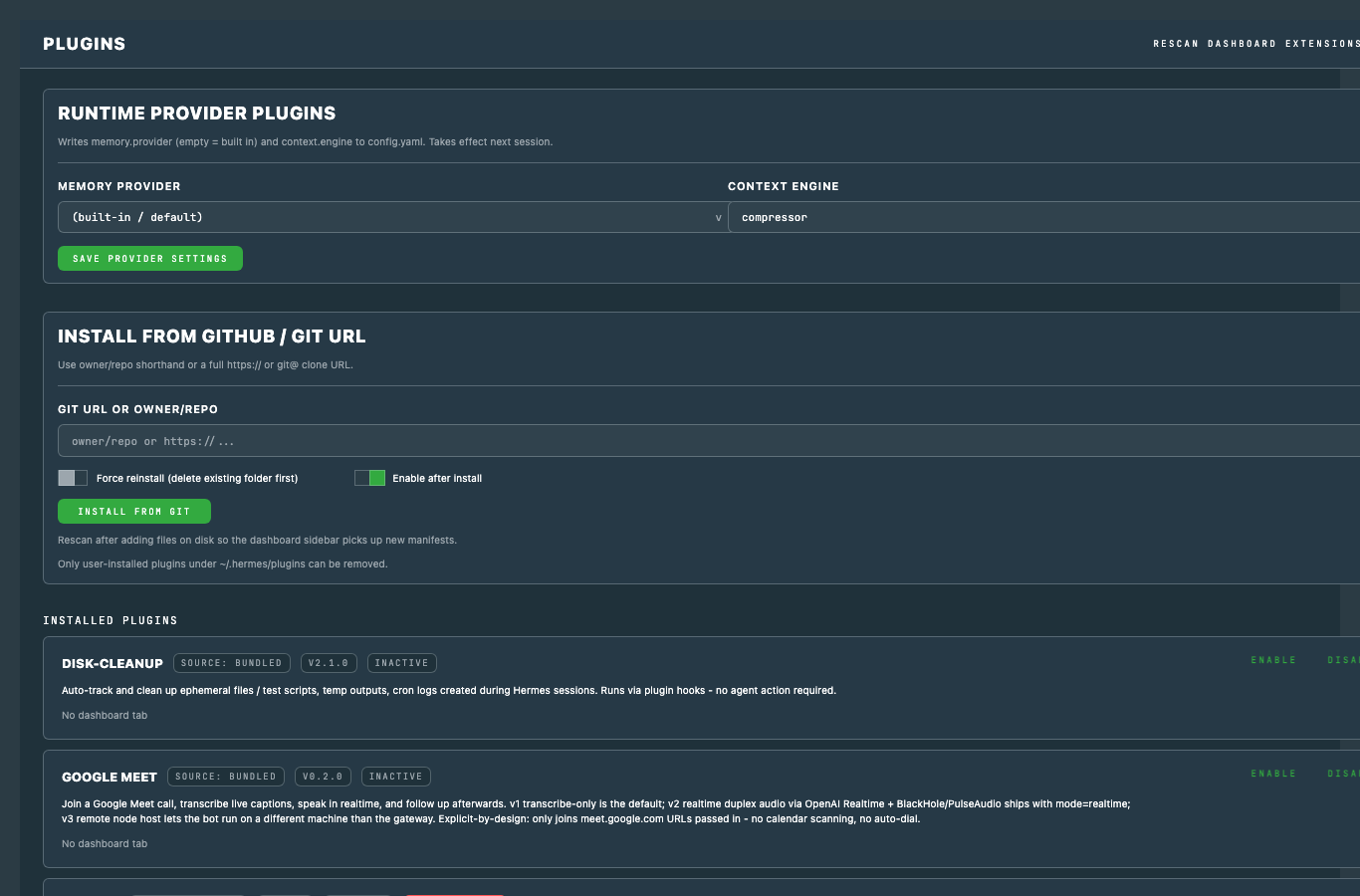 |
| Light theme | 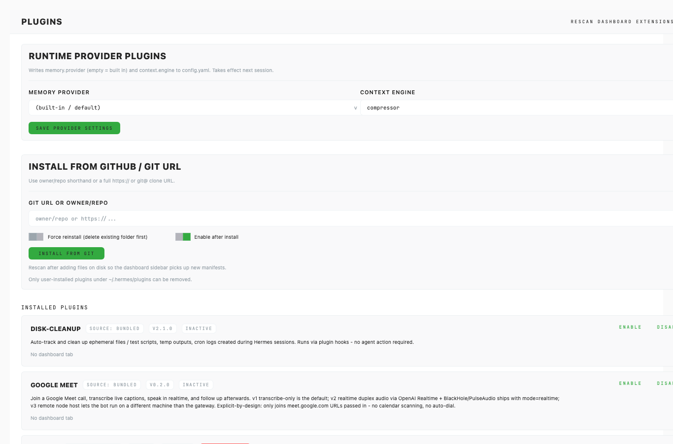 |
Usage Notes
- Prefer this component over local one-off UI for matching product states.
- Keep new variants represented in Storybook before adding docs references here.
- Use token-backed colors, spacing, radius, and shadows from Foundations.
Accessibility Notes
- Preserve keyboard and focus behavior from the source component.
- Any icon-only controls must provide an accessible label in consuming product code.
- Validate color contrast in both Equa dark and light theme screenshots before release.