EquaRolesPermissions
Last Verified: 2026-05-20 | Storybook source: equa-patternlib-nextjs/stories/EquaRolesPermissions.stories.tsx, Line: 25
Purpose
Roles and permissions role cards, permission matrices, and edit states.Storybook
| Story | Reference |
|---|---|
| Role Card Panel 33 | Storybook |
| Required Role Cards | Storybook |
| Role Catalog | Storybook |
| Role Landing | Storybook |
| Permissions Matrix | Storybook |
| Permissions Edit | Storybook |
| Final Designs Mirror | Storybook |
| Design Library Audit | Storybook |
| Plugins Dashboard Mirror | Storybook |
| Plugins Top Bar Mirror | Storybook |
| Runtime Provider Plugins Mirror | Storybook |
| Install From Git Mirror | Storybook |
API And Props
| Prop or Control | Source | Notes |
|---|---|---|
| UNVERIFIED | Not exposed in Storybook argTypes | Review component TypeScript interface |
equa-patternlib-nextjs/src/components/roles-permissions/roles-permissions.tsx, Line: 31equa-patternlib-nextjs/src/components/roles-permissions/index.tsequa-patternlib-nextjs/src/components/rolespermissions/rolespermissions.tsxequa-patternlib-nextjs/src/components/rolespermissions/index.tsequa-patternlib-nextjs/stories/EquaRolesPermissions.stories.tsx, Line: 25
Figma
Open Figma referenceScreenshots
| State | Asset |
|---|---|
| Equa dark theme | 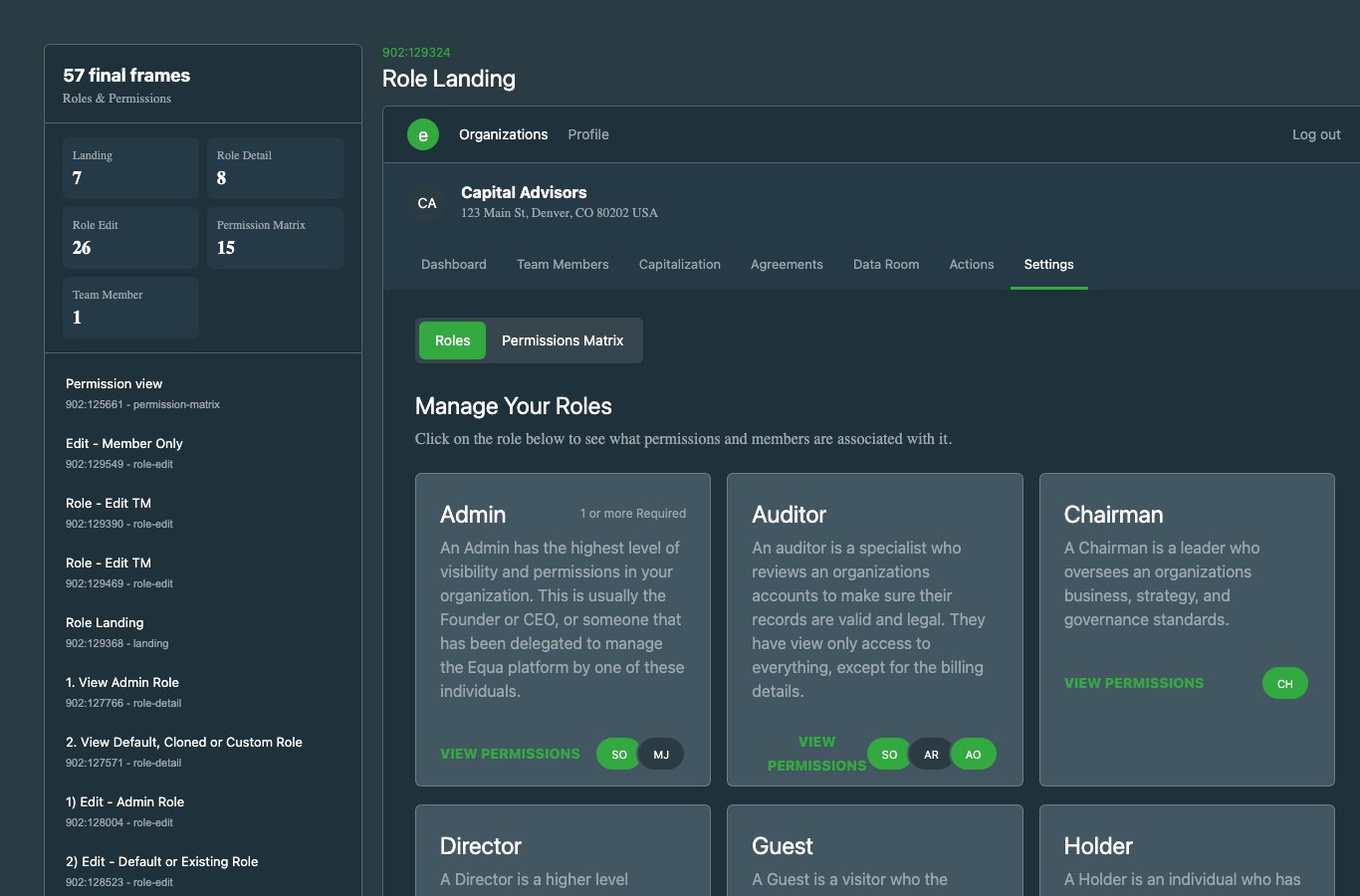 |
| Light theme | 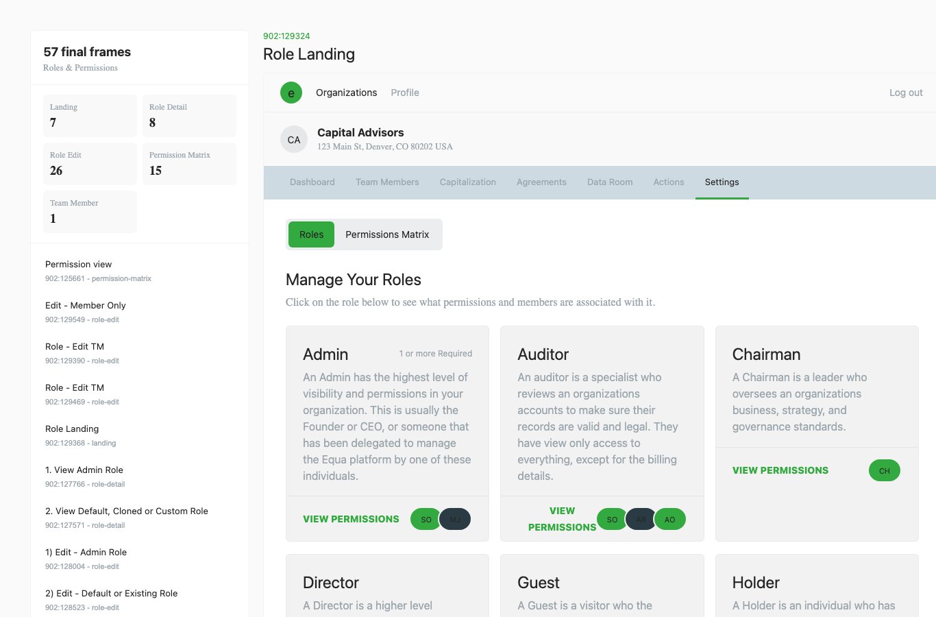 |
Usage Notes
- Prefer this component over local one-off UI for matching product states.
- Keep new variants represented in Storybook before adding docs references here.
- Use token-backed colors, spacing, radius, and shadows from Foundations.
Accessibility Notes
- Preserve keyboard and focus behavior from the source component.
- Any icon-only controls must provide an accessible label in consuming product code.
- Validate color contrast in both Equa dark and light theme screenshots before release.