EquaSwitch
Last Verified: 2026-05-20 | Storybook source: equa-patternlib-nextjs/stories/EquaSwitch.stories.tsx, Line: 6
Purpose
Binary switch controls for settings and preferences.Storybook
API And Props
| Prop or Control | Source | Notes |
|---|---|---|
size | Storybook control | See source story for accepted values |
labelPosition | Storybook control | See source story for accepted values |
disabled | Storybook control | See source story for accepted values |
equa-patternlib-nextjs/src/components/switch/switch.tsx, Line: 5equa-patternlib-nextjs/src/components/switch/index.tsequa-patternlib-nextjs/stories/EquaSwitch.stories.tsx, Line: 6
Figma
UNVERIFIED — requires Figma node assignmentScreenshots
| State | Asset |
|---|---|
| Equa dark theme | 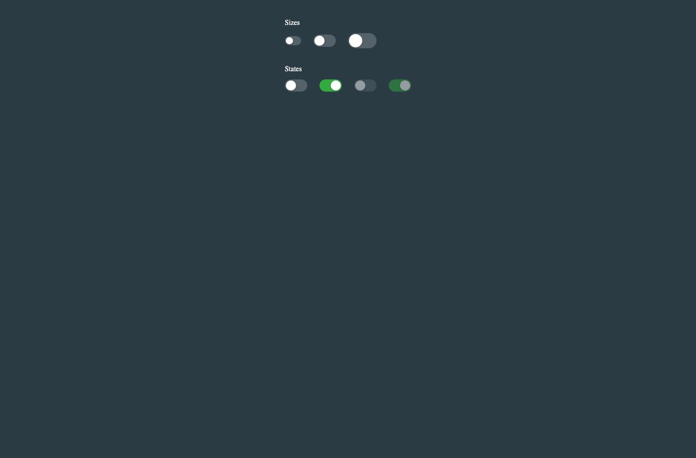 |
| Light theme | 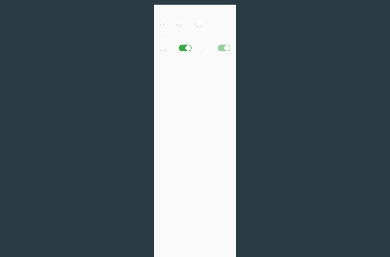 |
Usage Notes
- Prefer this component over local one-off UI for matching product states.
- Keep new variants represented in Storybook before adding docs references here.
- Use token-backed colors, spacing, radius, and shadows from Foundations.
Accessibility Notes
- Preserve keyboard and focus behavior from the source component.
- Any icon-only controls must provide an accessible label in consuming product code.
- Validate color contrast in both Equa dark and light theme screenshots before release.